| tags:R statistical graphics visualization ggplot2 lattice
Easy alternatives to bar charts in native R graphics
It’s a long tradition in statistical graphics going from Tufte back to Tukey and Cleveland to advise against using bar charts. Many folks, including me, have pejoratively called the common (in ecology, at least) bar chart + SE a “dynamite plot”. Although Ben Bolker has questioned the wisdom of this sentiment , I think in most cases they’re worth avoiding. (I discuss this more in “When and here are dynamite plots appropriate” below.)
Last week, Tracey Weissgerber and colleagues extend this tradition, making a great set of concrete recommendations in a perspective for PLoS Biology. Importantly, the authors also provided a set of Excel templates on CTSpedia (a cool-looking site for sharing resources related to clinical trials) that implement their recommendations in Excel.
This is great because in Excel making good graphics is really hard. So people don’t do it. Best practices have little appeal if they also involve lots of work! Fortunately in R, the recommended alternatives are built in, and even easier to use.
Here, I’ll provide some minimal code to make plots similar to those Weissgerber et al recommend, both for independent groups and paired data, using the built-in graphics of R.
Independent groups
For convenience, I’m using the built in CO2 dataset:
head(CO2)## Plant Type Treatment conc uptake
## 1 Qn1 Quebec nonchilled 95 16.0
## 2 Qn1 Quebec nonchilled 175 30.4
## 3 Qn1 Quebec nonchilled 250 34.8
## 4 Qn1 Quebec nonchilled 350 37.2
## 5 Qn1 Quebec nonchilled 500 35.3
## 6 Qn1 Quebec nonchilled 675 39.2These data come from an experiment on cold tolerance in grasses from different
regions, but the specifics here don’t matter. The data were first published in
Ecology in 1990. See ?CO2 in R if you’d like to know more.
Mostly, I’ll plot CO2 concentration versus uptake or Type, the plant’s source region.
First, a bad ol’ dynamite, er bar plot:
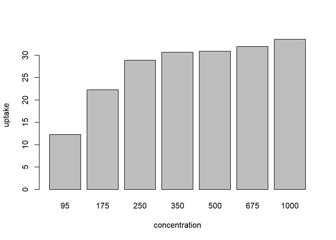
Figure 1: bad bar plot
(I’m not including the code for this, because it’s what I’m recommending
against. Nor did I add error bars, so it’s not really a dynamite plot. R’s base
graphics make both producing this plot and, especially, adding error bars to
it, tedious compared to box plots or strip charts. Maybe this is a feature.
External libraries like ggplot or gplots make such graphics a lot easier.
See link at the end of this post.)
Scatter plots
The first type of plot is a univariate scatter plot. Most often, you’d want to
plot a response against some observational or experimental factors. Another
name for this type of plot is stripchart, which is what R calls it:
CO2 <- within(CO2, conc_f <- factor(conc))
y_limits <- c(0, max(CO2$uptake) * 1.15)
point_col <- gray(0.4)
stripchart(uptake ~ conc_f, CO2, method='jitter', pch=19, col=point_col,
           xlab='concentration', ylim=y_limits, vertical=TRUE)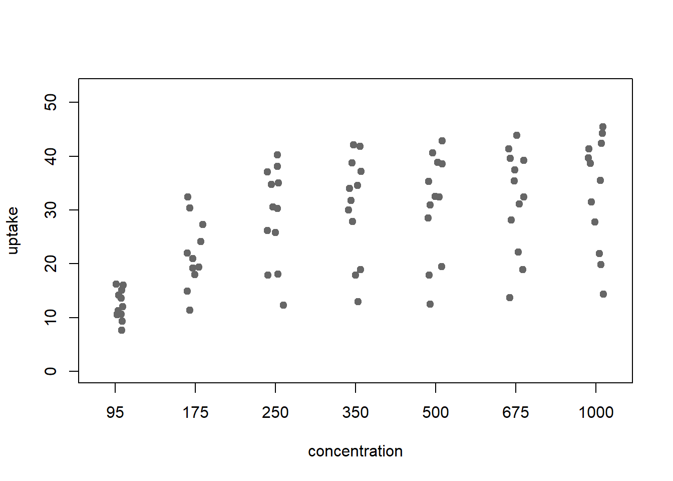
Figure 2: stripchart: a scatter plot v factors
It’s easy to jitter the points, as Weissgerber et al recommend, by passing the
argument method='jitter'. But there are other options. For cases where there
really isn’t much data, method='stack' gives something closer to a
Wilkinson dot plot.
This more clearly shows the values that were observed more than once:
stripchart(uptake ~ conc_f, CO2, method='stack', pch=19, col=point_col,
           xlab='concentration',  ylim=y_limits, vertical=TRUE)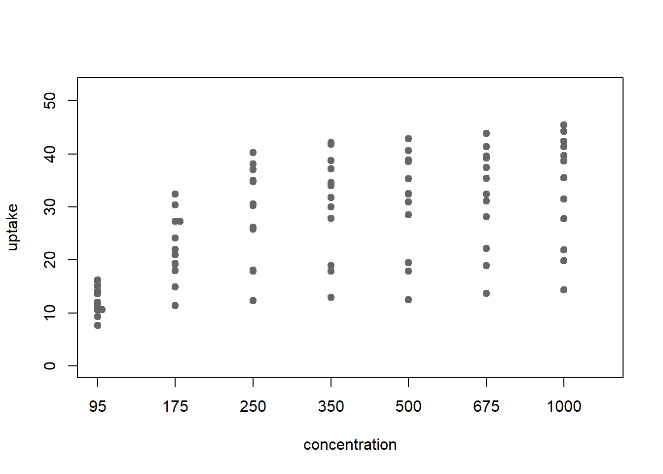
Figure 3: stripchart with stacking
Box (and whisker) plots
For box plots, R makes it very easy.
boxplot( uptake ~ conc_f , CO2, ylab='uptake', xlab='concentration', ylim=y_limits)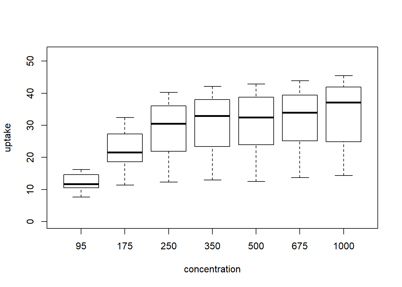
Figure 4: boxplot
In this case, with small data the boxplot is a bit misleading. This is
clear from the scatter plots above, but you can also overplot onto the
boxes using stripchart with add = TRUE, vertical = TRUE:
{
  boxplot( uptake ~ conc_f , CO2, ylab='uptake', xlab='concentration', ylim=y_limits)
  stripchart(uptake ~ conc_f, CO2, method = 'jitter', add = TRUE, vertical = TRUE,
             pch = 19)
}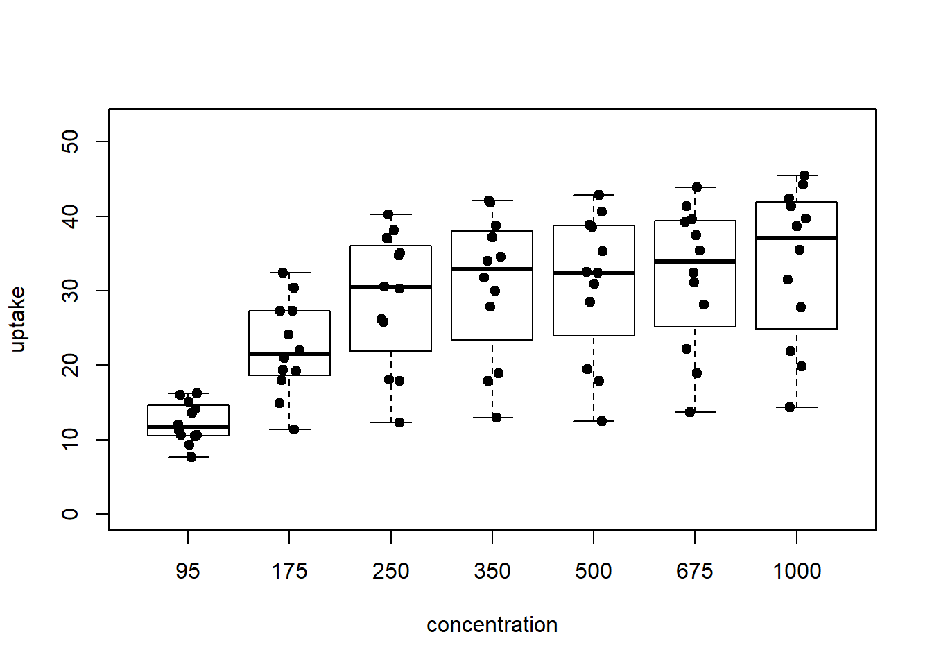
Figure 5: boxplot with points overplotted
Even with base graphics boxplot, you can pass functions of multiple
independent variables. This means you can visualize interactions between
treatments in your raw data, and even overplot with stripchart!
{
  boxplot( uptake ~ conc_f : Treatment, CO2, ylab='uptake', ylim=y_limits,
          xlab = "concentration within chilling treatment")
  stripchart(uptake ~ conc_f : Treatment, CO2, method = 'jitter', add = TRUE, vertical = TRUE,
             pch = 19)
}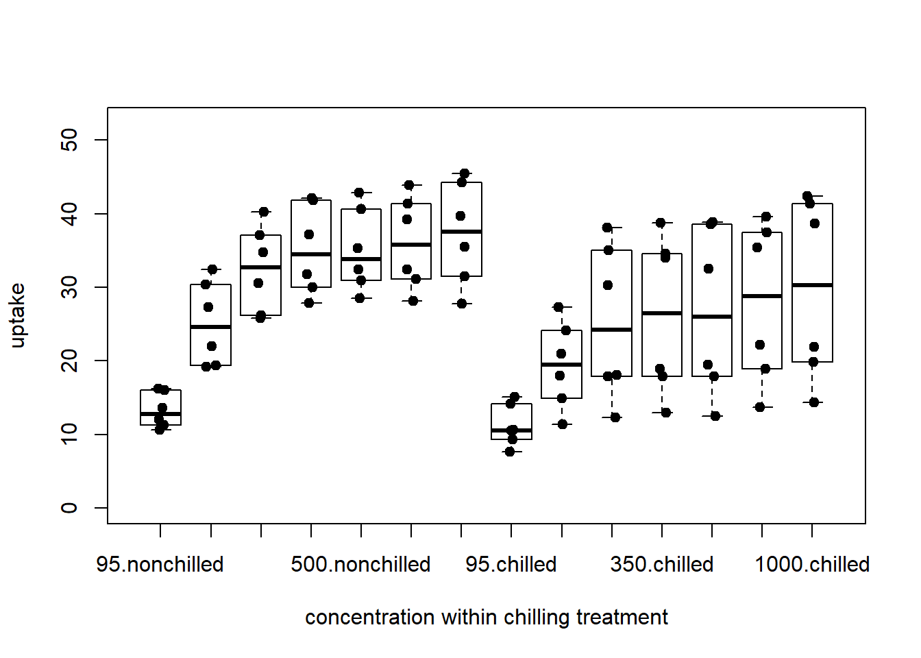
Figure 6: complex bar plot
Note it would be easier to read the labels here if the plot were horizontal, for which there’s an argument you can pass. The graphics settings on this post aren’t playing well with long labels, so I don’t evaluate this here:
op <- par(las = 1, mar = c(4, 8, 2, 1)) # all axis labels horizontal
   boxplot( uptake ~ conc_f %in% Treatment, CO2, xlab='uptake', horizontal=TRUE)
par(op)
Paired data
The CO2 data aren’t paired. To look at paired scatter plots, I’ll use the built
in sleep data, which show extra sleep for subjects taking two sleep aids.
head(sleep)## extra group ID
## 1 0.7 1 1
## 2 -1.6 1 2
## 3 -0.2 1 3
## 4 -1.2 1 4
## 5 -0.1 1 5
## 6 3.4 1 6The easiest way to make plots that link paired data is to again use
stripchart as a base. Then, to add lines illustrating the pairs, one can
use split and lines:
{
  stripchart(extra ~ group, sleep, pch=19, col=point_col,
             vertical=TRUE, ylab='extra sleep', xlab='drug received')
  for(ID in split(sleep, sleep$ID))
    lines(extra ~ group, ID)
}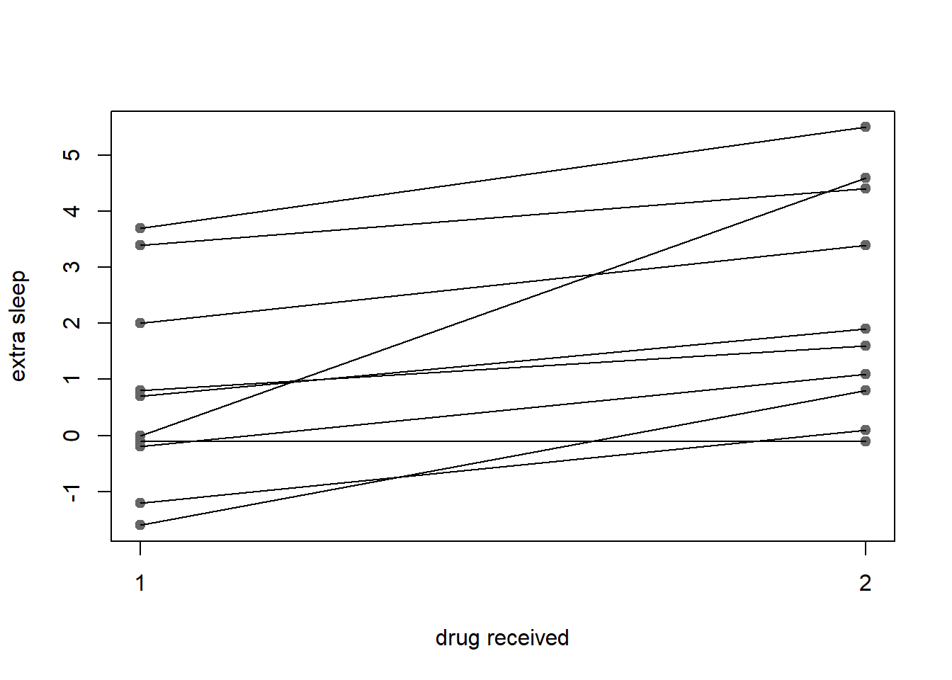
Figure 7: paired points connected by lines and marked by points
If you’d rather only have the lines, just suppress plotting of points within
the initial call to stripchart:
{
  stripchart(extra ~ group, sleep, pch="", vertical=TRUE,
             ylab='extra sleep', xlab='drug received')
  for(ID in split(sleep, sleep$ID))
    lines(extra ~ group, ID)
}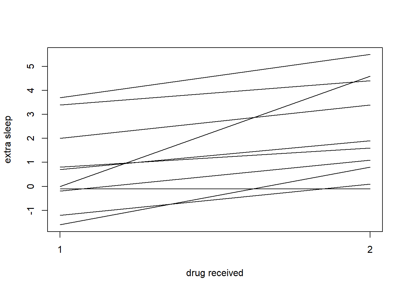
Figure 8: paired locations connected by lines
Other plots
R easily produces many other plots, in addition to those Weissgerber et al for which provide templates.
For example, say you’d like a histograms across subsets. Here’s one for uptake
from the CO2 data for grass plants receiving chilling or not:
op <- par(mfrow=c(2, 1))
for(v in levels(CO2$Treatment)) {
  subs <- subset(CO2, Treatment == v)
  hist(subs$uptake, main = v, col = point_col, xlab = 'uptake', xlim = y_limits)
  }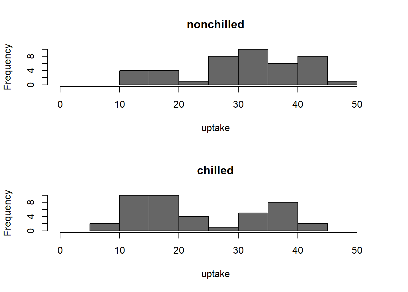
Figure 9: histogram of uptake
par(op)References: plotting libraries and examples
- lattice uses a formula interface on top of grid graphics
- ggplot2 implements the grammar of graphics on top of grid graphics
- note if you’re familiar with one of the above and not the other, see this guide to translating between lattice and qplot and this post summarizing an extensive comparison of the two libraries
- Ben Bolker’s
post on dynamite plots, in which he
produces a variety of plots on the same data using both
ggplot2and an older librarygplots
When and where are dynamite plots appropriate?
In addition to Ben’s post linked above, Solomon Messing has some nice reasons to choose dot plots for estimates +/- SE (three paragraphs beginning with “Why do I use dot plots…”). These boil down to:
- bar charts emphasize comparison to zero, which can make comparison of small differences difficult
- bars are often used in histograms, which can confuse some audiences
- dot plots use more ink, and cognition, which causes the eye to compare the estimate with the baseline
I agree with Ben that this last feature, the implied reference to a baseline, means bar charts, can be very useful. But there’s a corollary here: only use this strength when comparison to a baseline is the point. Further, then, if your graphics are to be honest, they must start at a meaningful zero. So, avoid bar charts for estimated quantities. Unless, your main comparison is between estimates with different, or with magnitudes very close to zero.