| tags:visualization lattice model checking statistical graphics GLMM R ggplot2
Visualizing fits, inference, implications of (G)LMMs
In a live walk-through on April 10 at the Davis R-Users Group, I gave a brief presentation motivating this topic. This post expands and cleans up the code from that talk. If you just want the code: download the .R file.
Updated 2015-04-28
The point of this post isn’t the statistics of mixed models. For that, learning the experimental design and statistics behind modern mixed models, I recommend some relatively recent papers below. In short, Schielzeth & Nakagawa (2013) and Stroup (2015) provide especially good introduction for those coming from an ANOVA background.
When working with generalized, hierarchical designs, ask yourself three questions:
First (and maybe most important), “Do I really need these models?” Think carefully, and consult these references:
- Is nesting doing anything for your analysis? Example 1: Murtaugh 2007 Ecology 88(1):56-62)
- For significance testing, transform + LMM might work as well as GLMM: Ives 2015 “For testing the significance of regression coefficients, go ahead and log-transform count data” Methods in Ecology and Evolution 1
Second, “What is my design (in the language of mixed models)?”. Baayen et al
focus on designs with crossed random effects (a strong suit of lme4), while
Schielzeth & Nakagawa’s “Nested by Design” paper is a more general
introduction. Finally, the Stroup paper provides a good entry point in
ANOVA-speak 2. This could make or break the connection between an
adviser that speaks only ANOVA, as is often the case for workers in crop and
soil sciences, or experimental ecology and the GLMM that your unbalanced
binomial regression demands.
- Schielzeth & Nakagawa 2013 Nested by design: model fitting and interpretation in a mixed model era. Methods in Ecology and Evolution 4:14-24
- Baayen, Davidson, & Bates 2008 Mixed-effects modeling with crossed random
effects for subjects and items. Journal of Memory and Language
59:390-412
Note that Baayen et al present
lme4code, but some (e.g.,mcmcsampwill not work with current versions of the package). - Stroup 2015 Rethinking the Analysis of Non-Normal Data in Plant and Soil Science. Agronomy Journal 107(2):811-827
Third, "How do I specify and fit this model in R. The references below may
also help with design and interpretation, but are primarily hands-on. The
most thorough is Pinheiro & Bates (2000). These four references also serve as a
bibliography of sorts for this post 3.
- Pinheiro & Bates 2000 Mixed-effects models in S and S-PLUS Springer, New York
- Bates’
lme4book draft - the lme4 paper:
- Ben Bolker’s forthcoming chapter on “Worked examples” available on Rpubs
Focus of this post
Given these preliminaries, here I focus on three things:
- criticizing the model and fit
- (graphically) assessing parameter inference
- illustrate predictions
emphasizing
- working with frequentist library
lme4for (G)LMM in R - visualization for: criticism, inference, prediction
- using the native plotting capabilities (to the extent possible)
three facets of visualization
- quick diagnostic (plots native to fitting packages)
- slower model criticism (also native)
- inference & prediction (generally lightweight external libraries / export capabilities)
Finally, I’ll mention that example code and vignettes in documented packages are great resources for learning these things (as is google ;). Try these commands:
??lme4
help(package='lme4')
methods(class='merMod')
vignette(package='lme4')
Packages:
library(lme4)## Warning: package 'lme4' was built under R version 3.6.1## Loading required package: Matrixlibrary(lattice) ## already loaded via namespace by lme4 -- may as well attach
#library(ggplot2) # recommend
#library(lsmeans) #recommend
#library(gridExtra) #recommendBelow, much of the commentary is included in # comments to the code blocks.
LMM: greenhouse full factorial (RCBD)
- “Simple” greenhouse, linear mixed model
- Pattern and amount – cool question!
- balanced so perfect for traditional ANOVA
- 4 (!) treatments – full factorial blocked so 4-way interaction potential and hard to visualize (making a good test case here)

Maestre title image
d <- read.delim("http://datadryad.org/bitstream/handle/10255/dryad.41984/Maestre_Ecol88.txt?sequence=1")
recode <- car::recode
## Registered S3 methods overwritten by 'car':
## method from
## influence.merMod lme4
## cooks.distance.influence.merMod lme4
## dfbeta.influence.merMod lme4
## dfbetas.influence.merMod lme4d <- within(d, {
nutrient_hetero <- recode(factor(nh), "1='homogeneous'; 2='heterogeneous'")
nutrient_add <- recode(factor(na), "1='40 mg N'; 2='80 mg N'; 3='120 mg N'")
water_hetero <- recode(factor(wh), "1='homogeneous'; 2='pulse'")
water_add <- recode(factor(wa), "1='125 mL'; 2='250 mL';3='375 mL'")
block <- factor(block)
})
d$nutrient_add <- factor(d$nutrient_add, levels(d$nutrient_add)[c(2, 3, 1)])
## centered?
ctr <- function(v, ...)
(v - mean(v, ...) ) #/ sd(v, ...)
d <- within(d, {
nhc <- ctr(nh)
nac <- ctr(na)
wac <- ctr(wa)
whc <- ctr(wh)
})## bt - total biomass
## we'd like to use model that includes varying sopes
## watering seems the most likely to have block-level differences ?
m2 <- lmer(log(bt) ~ nutrient_add * nutrient_hetero * water_add * water_hetero +
(water_hetero * water_add | block), data=d)## boundary (singular) fit: see ?isSingular## first diagnostic -- very high correlation is bad -- can't really justify complex RE
## structures you might like, if cause these type of fits!
## could see bad performance in resid plots too if you wanted
VarCorr(m2)## Groups Name Std.Dev. Corr
## block (Intercept) 0.031293
## water_heteropulse 0.041218 -0.741
## water_add250 mL 0.060201 -0.936 0.642
## water_add375 mL 0.059746 -0.612 0.231 0.845
## water_heteropulse:water_add250 mL 0.073590 0.937 -0.929 -0.852
## water_heteropulse:water_add375 mL 0.073299 0.415 -0.110 -0.706
## Residual 0.070228
##
##
##
##
##
## -0.461
## -0.969 0.290
## plot(m2, type = c("p", "smooth") , id = 0.05) # id outliers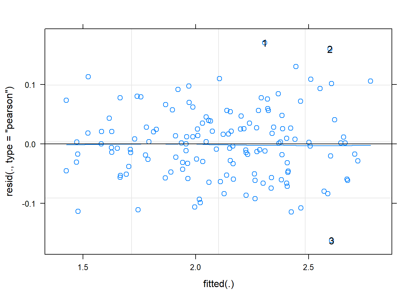
plot(m2, sqrt(abs(resid(.))) ~ fitted(.), type=c('p', 'smooth'))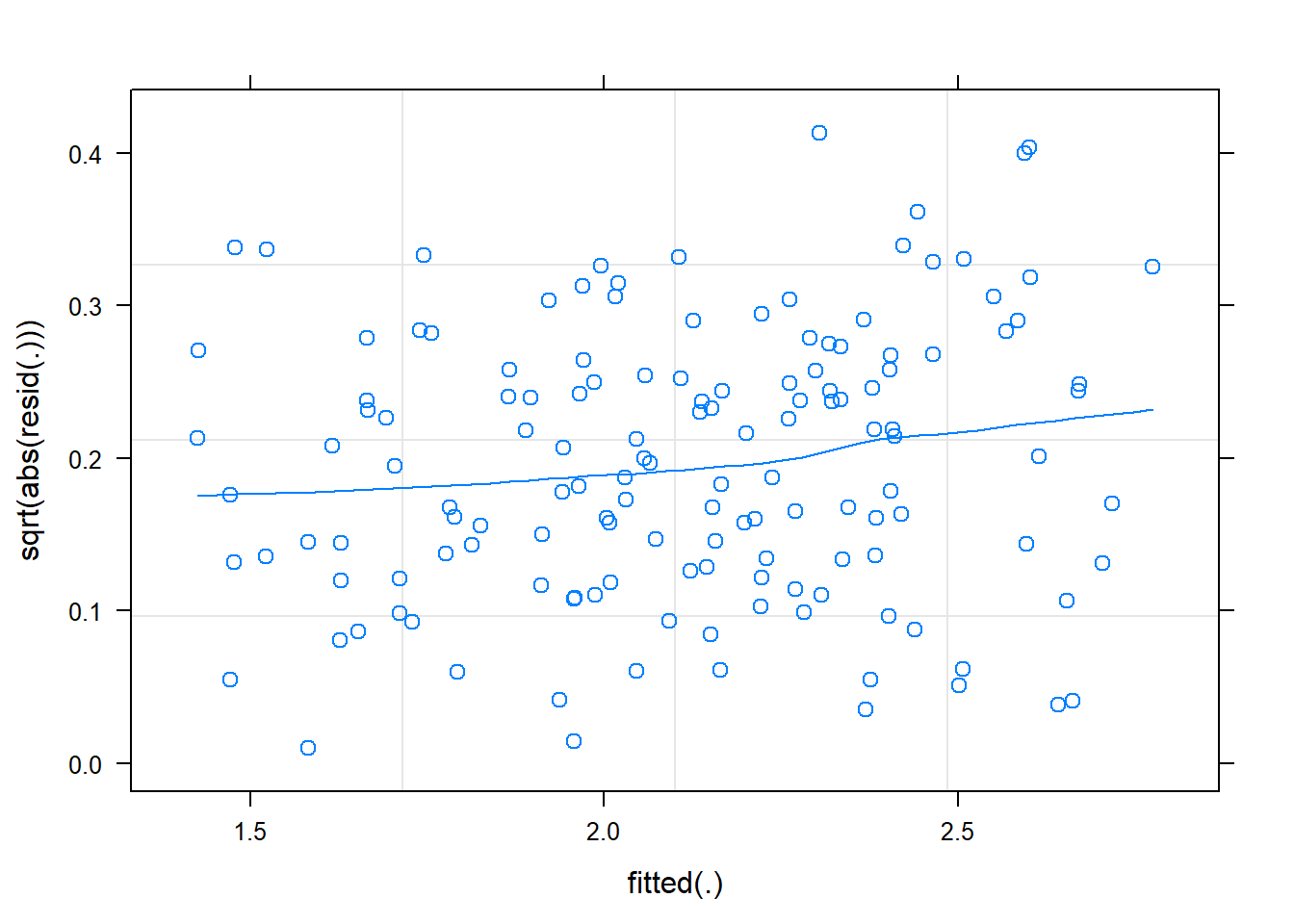
## slight increase in resid w/ fitted

plot(m2, resid(.) ~ fitted(.) | block, abline=c(h = 0),  lty = 1,  type = c("p", "smooth")) # per block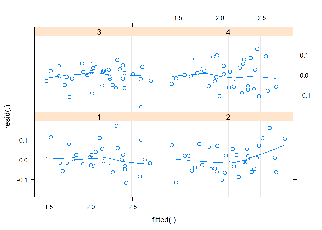
plot(m2, sqrt(abs(resid(.))) ~ fitted(.) | block, type=c("p", "smooth")) # 2 blocks behave badly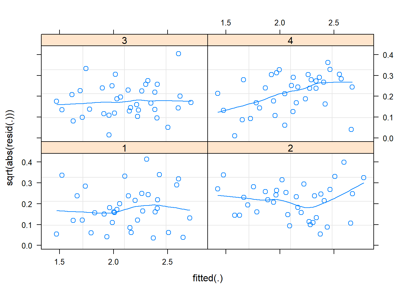
## block 4 is not great well behaved :(
lattice::qqmath(m2)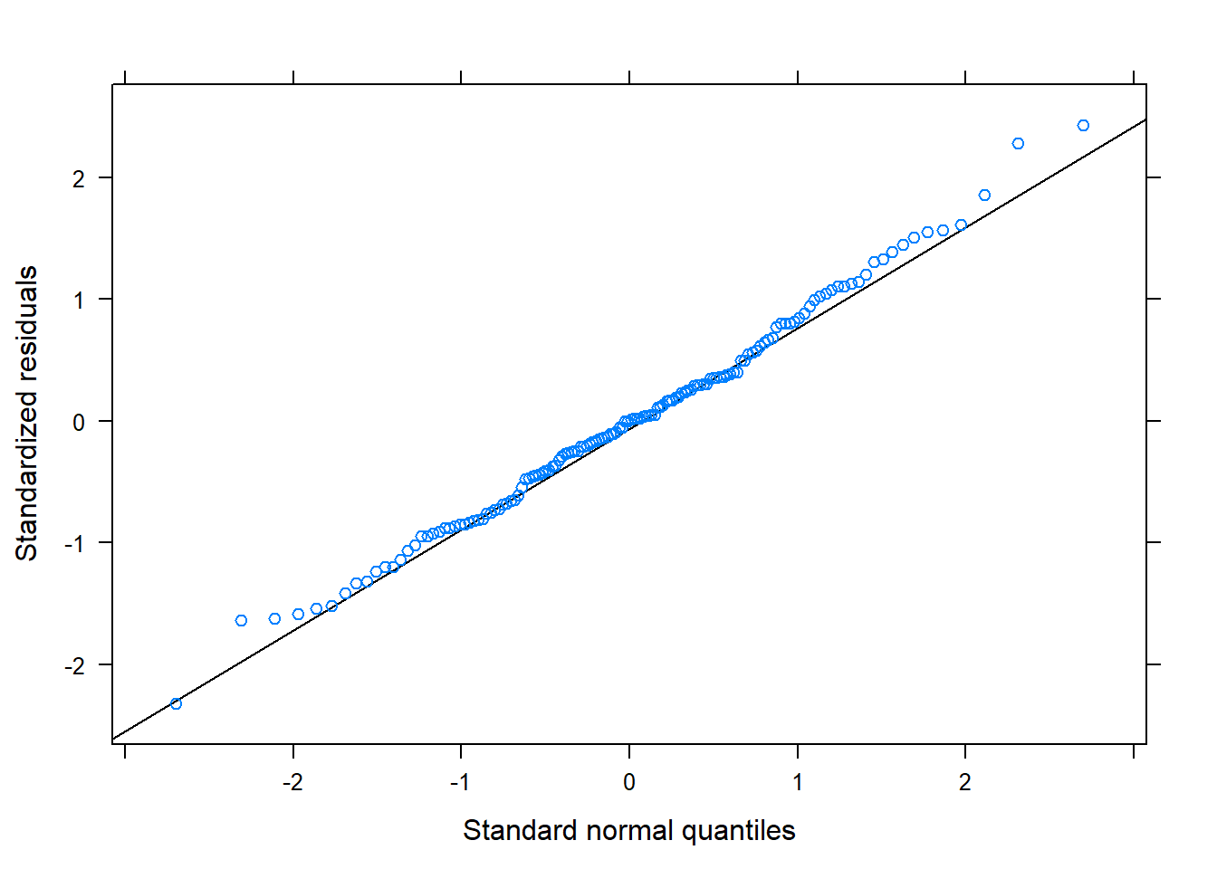
## look at random effect
lattice::dotplot(ranef(m2, condVar=TRUE))
## $block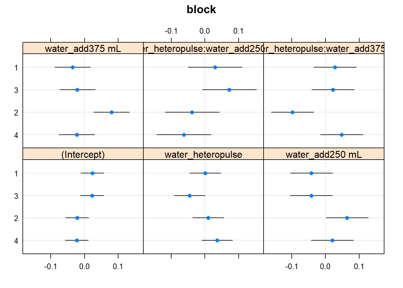
##were we to have LOTS of RE, using lattice::qqmath for y axis spacing
##based on quantiles of standard normal -- is better to distinguish
##important few from "trivial many"


## want to look @ 4-way but profile diagnostics not working

## for illustrating these, I fit a model with fewer interactions
## use quick plot assess which fixef we can drop (in addition to the RE, unf)
## run drop1(m2) and drop 4-way and water_hetero:nutrient_add
m1 <- lmer(log(bt) ~ nutrient_add * water_add * nutrient_hetero +
           nutrient_hetero *  water_add  * water_hetero  +
           (1 | block),
           data=d)

## Note: if you look at diagnostics for these, issues pointed out
## above seem even worse. there is a greater increase in resid w/ fitted
## several of the blocks are poorly behaved
## plot(m1, type=c("p", "smooth") , id=0.05) # id outliers
## plot(m1, sqrt(abs(resid(.))) ~ fitted(.), type=c('p', 'smooth'))
## plot(m1, resid(.) ~ fitted(.) | block, abline=c(h=0), lty=1,  type=c("p", "smooth")) # per block
## plot(m1,  sqrt(abs(resid(.))) ~ fitted(.) | block,     type=c("p", "smooth")) # 2 blocks behave  badly
## lattice::qqmath(m1)
## lattice::dotplot(ranef(m1, condVar=TRUE))
## to get more informative diagnostics -- need to profile
system.time(m1.prall <- profile(m1))## user system elapsed
## 1.72 0.00 1.72system.time(m1.prre <- profile(m1, which='theta_', maxmult=5)) ## lower maxmult to avoid step error## user system elapsed
## 0.27 0.00 0.26lattice::xyplot(m1.prall)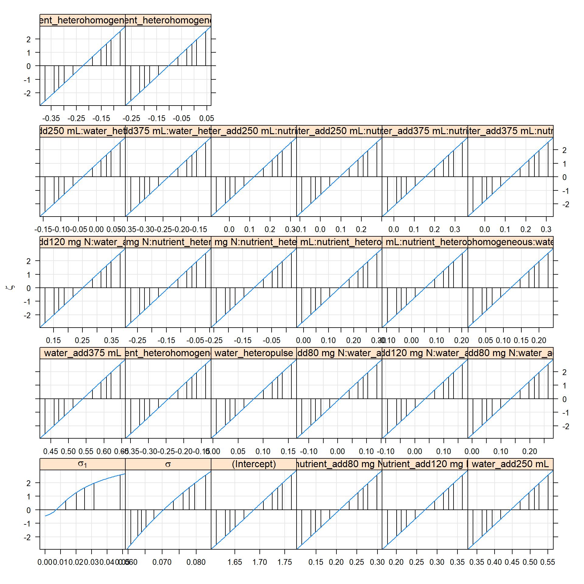
# lattice::xyplot(m1.prre) # for only re
# the 'profile zeta plot' linear indicates a quadratic
# likelihood profile, and so Wald approximations for CI will work well
# random effects parameters on a standard deviation (or correlation)
# scale

lattice::densityplot(m1.prall)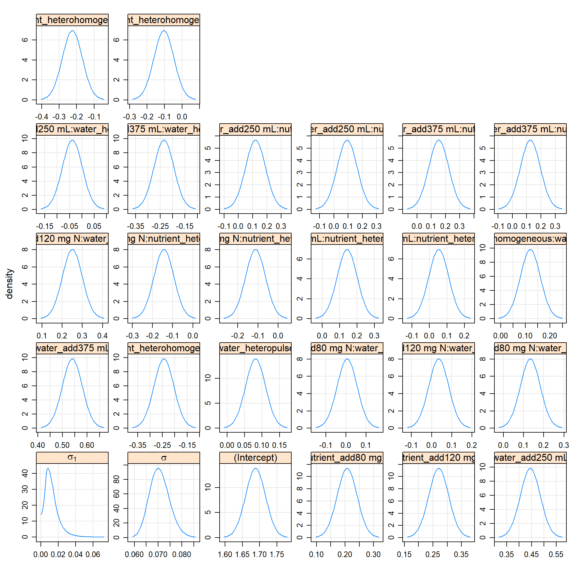
# the 'profile density plot'
# approximate probability density functions of the parameters
# -- distros underlying profile confidence intervals
# linear zeta plot <==> gaussian densities
lattice::splom(m1.prre)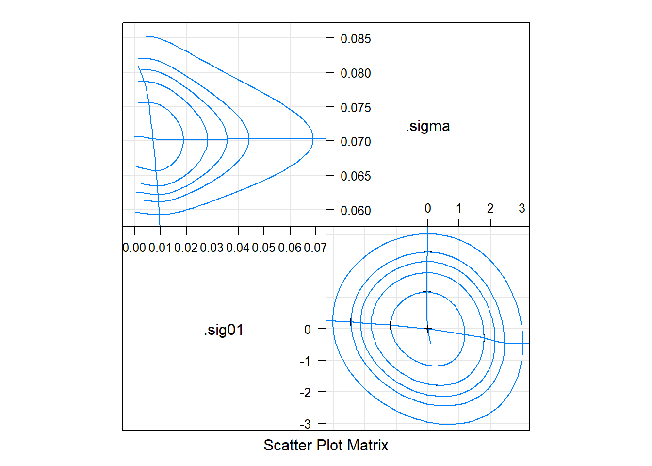
# the 'profile pairs plot'
# bivariate confidence regions based on profile
# 'profile traces' -- cross hairs -- are conditional estimates  of one parameter given the other
# above-diag: estimated scale
# below-diag: 'zeta' scale, some sense, the best possible set of single-parameter transformations for assessing the contours"
# we just look at RE here
Implications – lsmeans
Understanding a complex model with high-order interactions is tough. The best tool is plotting, but quickly visualizing such models is not easy with flexible plotting libraries.
Fortunately, lsmeans, although fairly inflexible in general, has
plotting capabilities designed just for this purpose. Here’s a demo
with the full (4-way interacting) model
## look at consequences
if(require(lsmeans)){
    ## here for 4-way interaction model (m2) -- mostly to see how can quickly plot response
    ## at factor levels in complex models
    ## relatively easy to plot mean prediction on response scale account for complex interaction
    lsmip(m2, nutrient_hetero ~  water_add | water_hetero * nutrient_add  , type='response')
    lsmip(m2, water_add ~ nutrient_add  | water_hetero * nutrient_hetero, type='response')
    lsmip(m2, water_add ~ water_hetero  | nutrient_add * nutrient_hetero, type='response')
}
## Loading required package: lsmeans## Warning in library(package, lib.loc = lib.loc, character.only = TRUE,
## logical.return = TRUE, : there is no package called 'lsmeans'if(require(lsmeans)){
## can also plot quickly mean estimates plus (Wald) confidence intervals
## not that it's possible to do finite size correction in lsmeans (but only for linear models)
## steps take a min w/ lots of RE for some reason
m2.lsm <- lsmeans(m2, ~ water_add * water_hetero | nutrient_hetero * nutrient_add)
plot(m2.lsm, layout =c(2, 3), horizontal=TRUE)
}## Loading required package: lsmeans## Warning in library(package, lib.loc = lib.loc, character.only = TRUE,
## logical.return = TRUE, : there is no package called 'lsmeans' ## for the simpler
lsmip(m1, nutrient_hetero ~ water_add | water_hetero * nutrient_add , type='response')
lsmip(m1, water_add ~ nutrient_add | water_hetero * nutrient_hetero, type='response')
lsmip(m1, water_add ~ water_hetero | nutrient_add * nutrient_hetero, type='response')
## overall pattern doesn't differ too much from m1
m1.lsm <- lsmeans(m1, ~ water_add * water_hetero | nutrient_hetero * nutrient_add)
plot(m1.lsm, layout =c(2, 3), horizontal=TRUE)Confidence intervals
quick & dirty
## OK -- back to the full model
## if residuals looking OK -- fastest way to get a quick look at coefficient uncertainty
## I'll make it a function for later use

quick_CI_df <- function(model, drop_intercept = TRUE,...) {
  ## coef table using WALD CIs for a merMod
  ci_dat <- confint(model, method='Wald', ...)
  ci_dat <- cbind(ci_dat, mean=rowMeans(ci_dat))
  ci_df <- data.frame(coef=row.names(ci_dat), ci_dat)
  names(ci_df)[2:3] <- c('lwr', 'upr')
  coef_colon <-   gregexpr("\\:", ci_df$coef)
  coef_order <- sapply(coef_colon, function(x) {
    if(x[1] == -1)
      return(0)
    else
      return(length(x))
  })
  ci_df$coef <- reorder(ci_df$coef, coef_order)
  if (drop_intercept)
    return(subset(ci_df, coef != '(Intercept)'))
  ci_df
}

m1_wald_ci <- quick_CI_df(m2)

lattice::dotplot(coef ~ mean, m1_wald_ci,
                 panel = function(x, y) {
                   panel.xyplot(x, y, pch=19)
                   panel.segments(m1_wald_ci$lwr, y, m1_wald_ci$upr, y)
                   panel.abline(v=0, lty=2)
                 })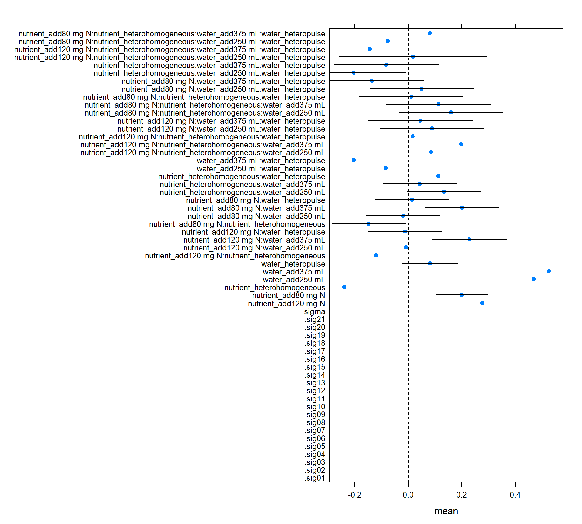
Confidence Intervals – rolling your own
For more control than the simple plot above, you could use any of a variety of
packages, e.g. coefplot2, arm::coefplot, here we just use builtin
lme4::confint to build a dataframe.
I make a dataframe with potentially several different types of confidence intervals: Wald (assume asymptotic multivariate normality of likelihood), profile, and bootstrap. For the random effects, the output of bootstrap and profile methods have different names – as you can see in the plot below. The Wald method only estimates CIs for fixed effects.
compare_CI_df <- function(modprof, model, BOOT=FALSE, ...) {
  ci <- confint(model, method='Wald')
  cip <- confint(modprof)
  if(BOOT) {
      cib <- confint(model, method="boot", ...)
      cib_dat <- data.frame(cib, parameter=row.names(cib), type='Boot')
      names(cib_dat)[1:2] <- colnames(cib)
  }
  ci_dat <- data.frame(ci, parameter=row.names(ci), type='Wald')
  names(ci_dat)[1:2] <- colnames(ci)
  cip_dat <- data.frame(cip, parameter=row.names(cip), type='Prof')
  names(cip_dat)[1:2] <- colnames(cip)
  if (!BOOT) {
      ci_all_dat <- rbind(ci_dat, cip_dat)
  } else {
      ci_all_dat <- rbind(ci_dat, cip_dat, cib_dat)
  }
  fe_dat <- data.frame(parameter=names(fixef(model)), value=fixef(model))
  list(mean=fe_dat, bounds=ci_all_dat)
}

if(require(ggplot2)) {
    m1_ci <- compare_CI_df(m1.prall, m1, BOOT=TRUE, nsim=100)
    m1_mean <- m1_ci[['mean']]
    m1_bnd <- m1_ci[['bounds']]

    ggplot(m1_bnd[m1_bnd$parameter != '(Intercept)', ]) +
    geom_linerange(aes(parameter, ymax=`97.5 %`, ymin=`2.5 %`, color=type),
                   position=position_dodge(w=.5), size=1.5) +
    geom_hline(yintercept=0, linetype=2) +
    coord_flip() + theme_minimal() +
    geom_point(aes(parameter, value), size=3, shape=3,
               data=m1_mean[m1_mean$parameter != '(Intercept)', ])

} else {
    lattice::dotplot(parameter ~ c(`2.5 %`, `97.5 %`) | type , m1_bnd, abline=c(v=0, lty=2))
    }
## Loading required package: ggplot2## Computing bootstrap confidence intervals ...##
## 38 message(s): boundary (singular) fit: see ?isSingular
## 1 warning(s): Model failed to converge with max|grad| = 0.00445866 (tol = 0.002, component 1)## Warning: Removed 2 rows containing missing values (geom_linerange).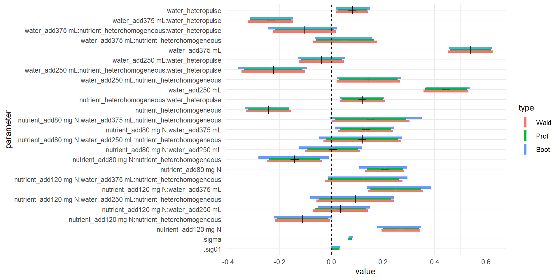
##   strong effect of nutrient homogeneity
##   effect of adding lots of water
## nutrient has some effect
Pulling data out of models with broom or ggplot2
Method ggplot2::fortify adds fitted and resid to data frame. New-ish CRAN
package broom generalizes this (and more), really aiming provide an interface
for ‘tidy’ (i.e., easy to plot)representations of model objects from many R
functions (including packages and base R). The broom method augment
really generalized version of fortify and is recommended instead
if(require(ggplot2)) {
    d_fort <- ggplot2::fortify(m1, d)
    ## adds .fortify, scresid, .resid
    ##head(d_fort)
}

if(require(broom)) {
    glm1 <- glance(m1) # model summary
    tdm1 <- tidy(m1, effects='fixed') #model coefficient summary
    augm1 <- augment(m1, d, se.fit=TRUE, type.predict='response') # model data with fits
    ## head(glm1)
    ## head(tdm1)
    ## head(augm1)
}
## Loading required package: broomUnfortunately, the predict and confint methods for merMod aren’t yet
integrated to broom or ggplot (or my code above for confidence intervals
could be much cleaner at the slight cost of an additional package dependency).
GLMM: Lizard mate choice
Mechanisms of speciation – cool question!
- mate compatibility trails
- western North American skinks (Plestiodon skiltonianus spp)
- Richmond, J. Q., E. L. Jockusch, and A. M. Latimer 2010. Mechanical reproductive isolation facilitates parallel speciation in western North American scincid lizards. American Naturalist
Repeated measure of ind crossed with multiple trials, binary outcome
d2 <- read.delim("http://datadryad.org/bitstream/handle/10255/dryad.33579/Richmond%20et%20al%202011%20Datafile.txt?sequence=1")
names(d2) <- gsub('\\.', '', names(d2))

# rescale geo dist, sizediff
d2 <- within(d2, {
    geodist_scl <- (GeoDist - mean(GeoDist)) / var(GeoDist)
    gendist_scl <- (GenDist - mean(GenDist))
    sizediff_scl2 <- ((SizeDiff - mean(SizeDiff)) / var(SizeDiff))^2
    Series <- factor(Series)
    Female <- factor(Female)
    Male <- factor(Male)
  })

## cop - copulation
system.time(gm0 <- glmer(cop ~   sizediff_scl2   + (1 | Series) + (1 | Male)  + (1 | Female) ,
               data=d2, family='binomial'))
## boundary (singular) fit: see ?isSingular## user system elapsed
## 0.41 0.00 0.41system.time(gm1 <- glmer(cop ~ gendist_scl + geodist_scl + sizediff_scl2 + (1 | Series) +
(1 | Male) + (1 | Female) , data=d2, family='binomial'))## boundary (singular) fit: see ?isSingular## user system elapsed
## 1.03 0.00 1.03anova(gm1, gm0) # no need for non-size predictors## Data: d2
## Models:
## gm0: cop ~ sizediff_scl2 + (1 | Series) + (1 | Male) + (1 | Female)
## gm1: cop ~ gendist_scl + geodist_scl + sizediff_scl2 + (1 | Series) +
## gm1: (1 | Male) + (1 | Female)
## Df AIC BIC logLik deviance Chisq Chi Df Pr(>Chisq)
## gm0 5 159.34 176.47 -74.673 149.34
## gm1 7 162.92 186.90 -74.460 148.92 0.4251 2 0.8085plot(gm0, type=c("p"), id = 0.05 )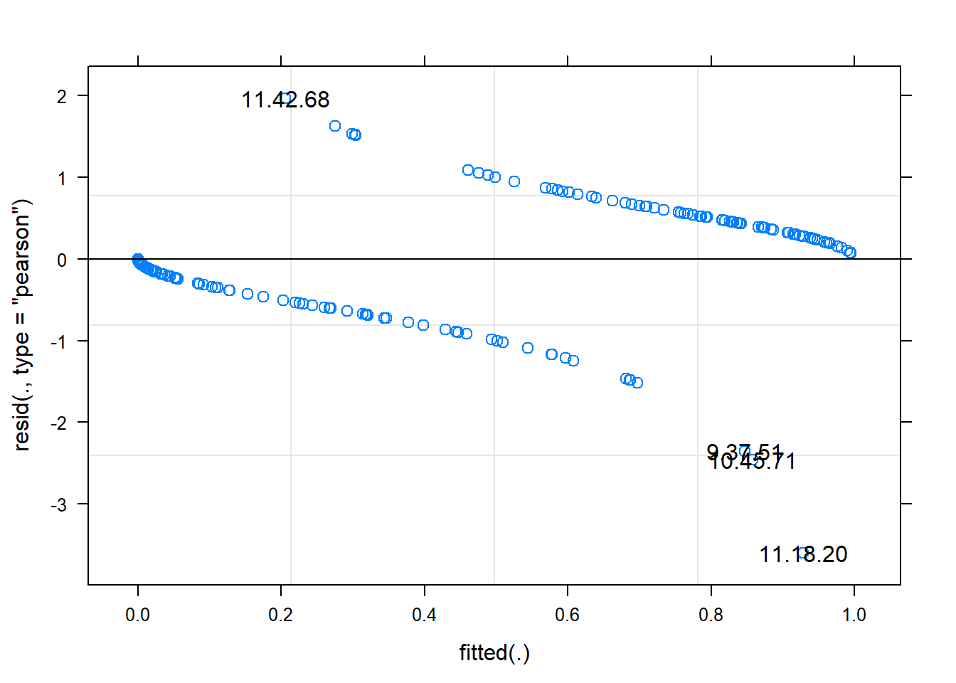
## non useful visually but with id = 0.05 gives sense of outlier
## see ?plot.merMod for explanation of test run

## it's more useful to plot residuals in GLM logistic combined across grouping factors
## or binned fitted values
plot(gm0,  factor(Trial) ~ resid(., type='pearson'),  abline=c(v=0), lty=2)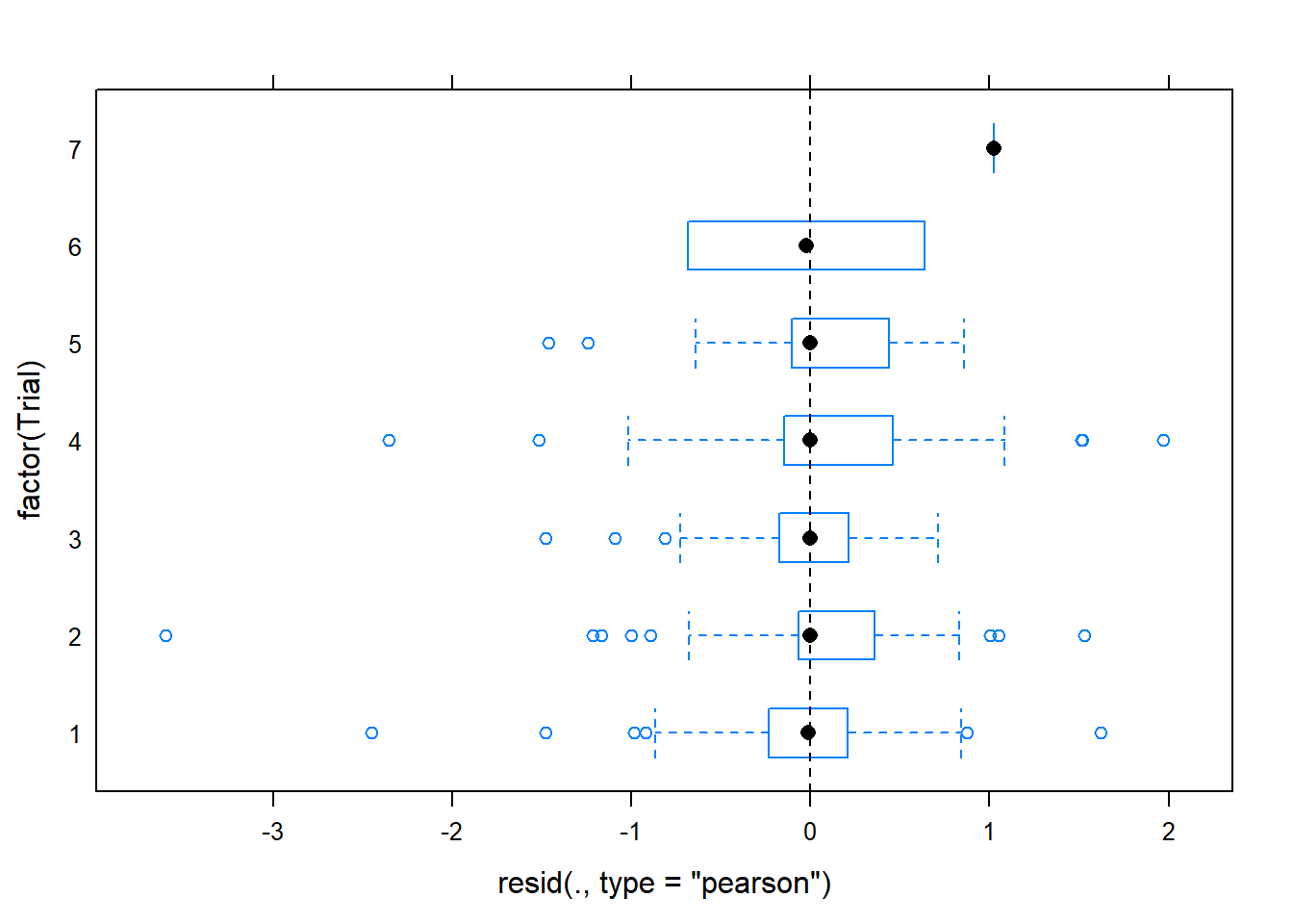
plot(gm0, factor(Series) ~ resid(., type='pearson'), abline=c(v=0), lty=2)
## better than default eh

## second plot suggests some issue with series, indicating we may want to
## fit a model accounting for differences between trial series
## (in fact, Richmond et al did fit such a model)
## you can see the outliers here too with
## plot(gm0, resid(., type='pearson') ~ fitted(.) | factor(Series), id = 0.05)

## main thing on pearson or deviance residuals is they're mostly less than 2
## (as assessed in first plot above -- second is the sqrt
## we could later drop these outlier and see if they change

if(require(gridExtra)) {
    do.call(gridExtra::grid.arrange, c(lattice::qqmath(ranef(gm0, condVar=TRUE)), list(nrow=1)))
} else {
    lattice::qqmath(ranef(gm0, condVar=TRUE))
  }
## Loading required package: gridExtra## Warning: package 'gridExtra' was built under R version 3.6.1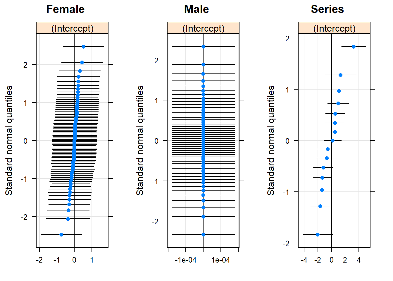
## useful if you have a lot of RE to draw attention to strong ones
## maybe latter == dot = sample size?

## no reason to retain RE on Male, but also drop Female
## no real justification, just very slow profiling for many RE
gm0noindre <- glmer(cop ~   sizediff_scl2   + (1 | Series), data=d2, family='binomial')

system.time(#
    gm0.prall <- profile(gm0noindre, devtol=1e-6) # see https://stat.ethz.ch/pipermail/r-sig-mixed-models/2014q3/022394.html
)
## user system elapsed
## 5.66 0.00 5.67#system.time(
# gm0_full.prall <- profile(gm0, devtol=1e-6)
#)
# user system elapsed
#344.092 0.539 344.613lattice::xyplot(logProf(gm0.prall))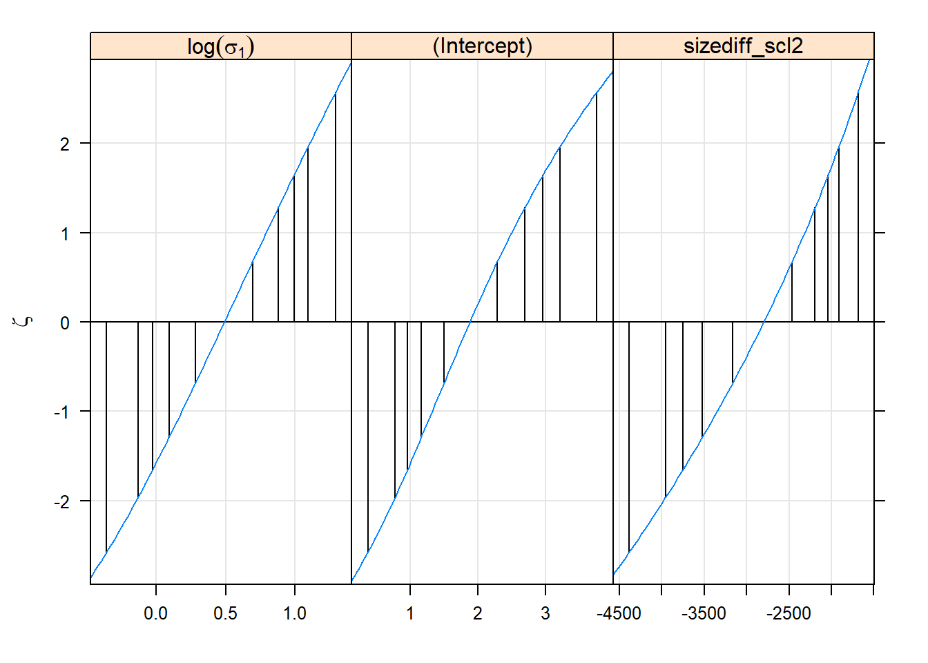
lattice::densityplot(gm0.prall)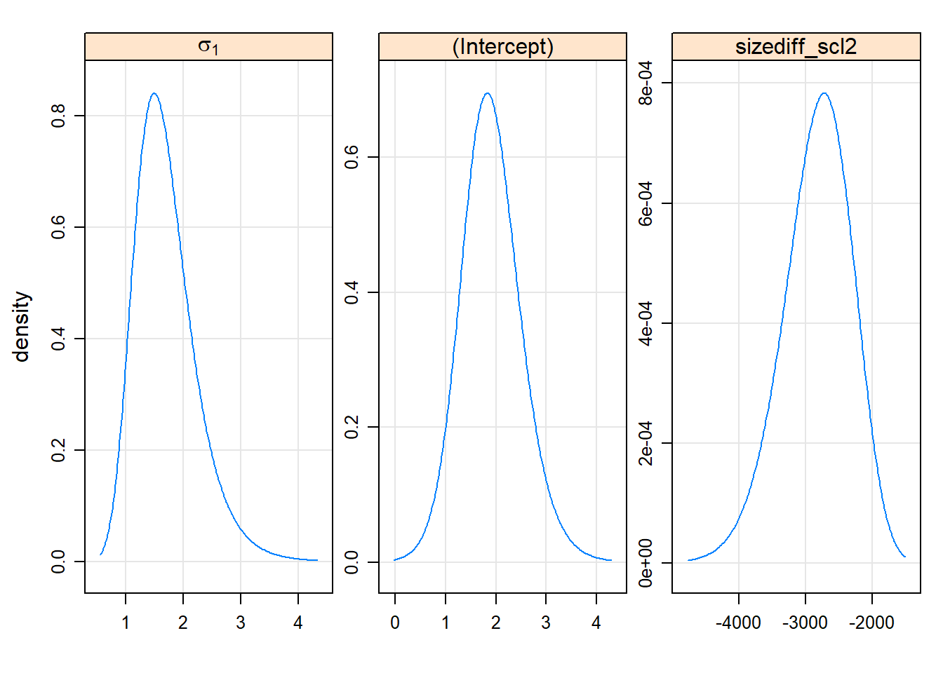
lattice::splom(gm0.prall)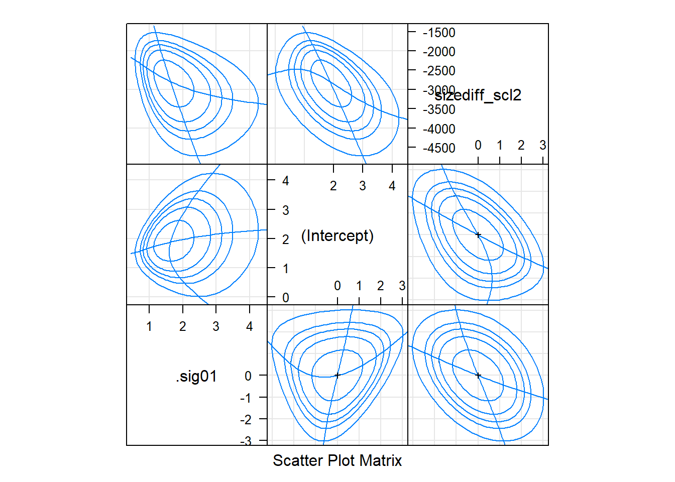
Confidence intervals
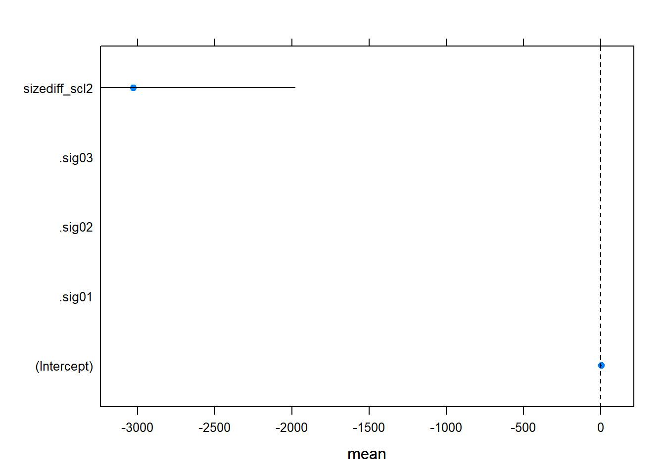
## if residuals looking OK -- fastest way to get a quick look at coefficient uncertainty
ci_dat <- confint(gm0, method='Wald')
ci_dat <- cbind(ci_dat, mean=rowMeans(ci_dat))
ci_df <- data.frame(coef=row.names(ci_dat), ci_dat)
names(ci_df)[2:3] <- c('lwr', 'upr')


lattice::dotplot(coef ~ mean, ci_df,
        panel = function(x, y) {
            panel.xyplot(x, y, pch=19)
            panel.segments(ci_df$lwr, y, ci_df$upr, y)
            panel.abline(v=0, lty=2)
        })
Rolling your own again
if(require(ggplot2)) {
  gm0_ci <- compare_CI_df(gm0.prall, gm0)
  gm0_mean <- gm0_ci[['mean']]
  gm0_bnd <- gm0_ci[['bounds']]
  g <- ggplot(gm0_bnd[gm0_bnd$parameter != '(Intercept)', ]) +
    geom_linerange(aes(parameter, ymax=`97.5 %`, ymin=`2.5 %`, color=type),
                   position=position_dodge(w=.5), size=1.5) +
    geom_hline(yintercept=0, linetype=2) +
    coord_flip() + theme_minimal() +
    geom_point(aes(parameter, value),
               size=3, shape=3,
               data=gm0_mean[gm0_mean$parameter != '(Intercept)', ])
  g
  } else {
    lattice::dotplot(parameter ~ c(`2.5 %`, `97.5 %`) | type , gm0_bnd)
      }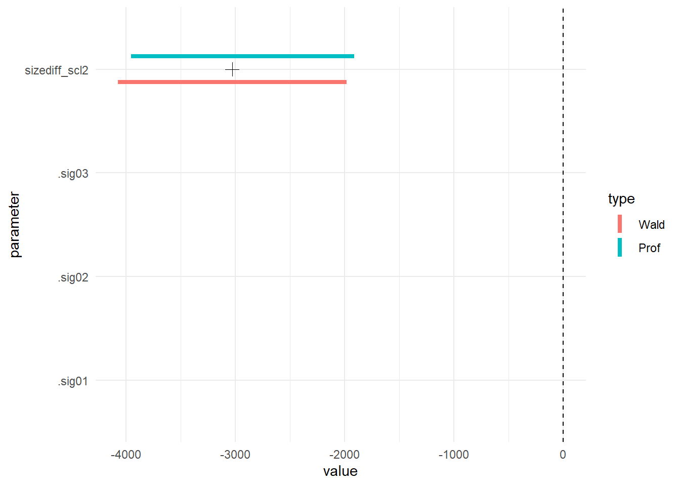
Because the fixed effect parameter on size difference and the random effect variance are on such different scales, I make two plots
if(require(ggplot2))
    g + scale_y_log10()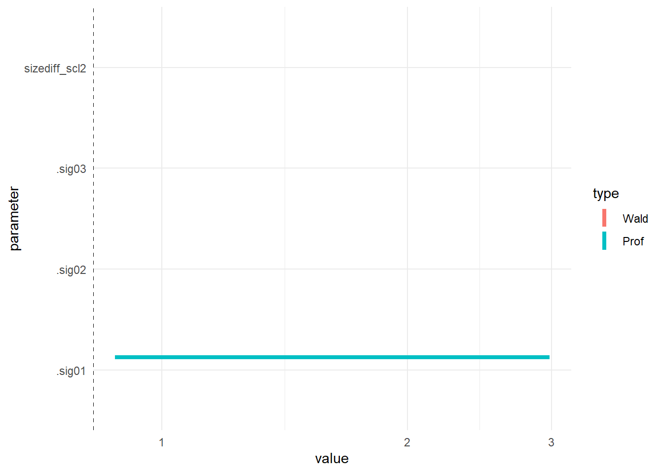
quick predictions
Again, the quickest way to visualize predictions is with lsmeans.
Two things are different here:
- to plot GLM predictions on a meaningful scale, you need to pass
type = 'response'to theplotfunction. - for a quantitative predictor, the default will plot a single point
at the mean of the predictor, to see prediction across the range, pass
a list to the
atargument - for more meaningful plots, we should label the plot y-axis with unscaled size differences (but I didn’t do this)
- note that you can produce plots at various levels of interacting quantitative predictors using this technique
if(require(lsmeans))

gm0_lsm <-    lsmeans(gm0, ~ sizediff_scl2,
                  at = list(sizediff_scl2 = seq(from=0,
                              to = 1.5 * median(d2$sizediff_scl2), length.out = 10)))
## Loading required package: lsmeans## Warning: package 'lsmeans' was built under R version 3.6.1## Loading required package: emmeans## Warning: package 'emmeans' was built under R version 3.6.1## The 'lsmeans' package is now basically a front end for 'emmeans'.
## Users are encouraged to switch the rest of the way.
## See help('transition') for more information, including how to
## convert old 'lsmeans' objects and scripts to work with 'emmeans'.## Warning in vcov.merMod(object, correlation = FALSE): variance-covariance matrix computed from finite-difference Hessian is
## not positive definite or contains NA values: falling back to var-cov estimated from RXplot(gm0_lsm, type = 'response', ylab = 'scaled size diff', xlab = 'probability of copulation')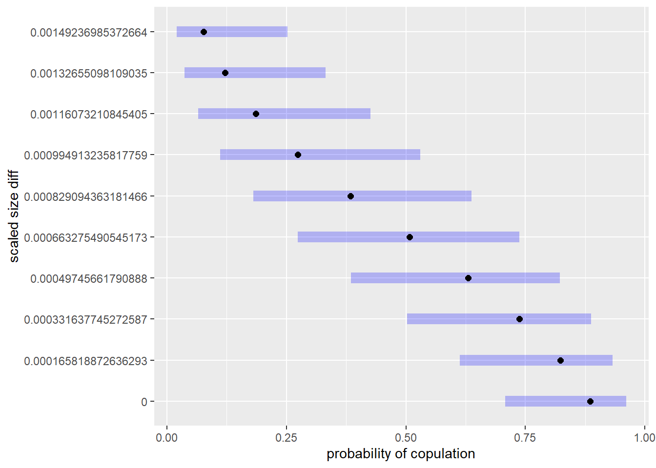 ## customized predictions
The quick plots using lsmeans are great, but they assume Wald confidence intervals
and don’t account for random effects.
To deal with the former, we need to bootstrap, which I won’t cover here, but
the problem of random effects is easily examined using the re.form argument
of predict.merMod in lme4. Here I look at predictions accounting for all,,
none, or some of random effects fitted:
## predicted effect
d2$pred_overall_gen <- predict(gm0, type='response', re.form=NA)
d2$pred_overall <- predict(gm0, type='response')
d2$pred_ind <- predict(gm0, type='response', re.form=~ (1|Female))
d2$pred_trial <- predict(gm0, type='response', re.form=~(1|Series))

## NB this changes row order from the fit!!!
d2_pred <- merge(d2, as.data.frame(table(Series=d2$Series)))

if(require(ggplot2)) {

g <- ggplot(d2_pred) +
     geom_point(aes(SizeDiff, cop),
                position=position_jitter(h=0.025, w=0)) +
     theme_minimal() +
     ylab("Probability copulation")


g1 <- g + geom_line(aes(SizeDiff, pred_trial, color=Series))

g2 <- g + geom_line(aes(SizeDiff, pred_overall_gen), color='orange', size = 1.5) +
    geom_point(aes(SizeDiff, pred_ind, alpha=as.numeric(Female)), color = 'blue') +
    theme(legend.position = "none")

gridExtra::grid.arrange(g1, g2, ncol=2)

} else {
    plot(cop ~ SizeDiff, d2_pred, ylab="Probability copulation")
    points(pred_ind ~ SizeDiff, d2_pred, pch=19, cex=.5, col='darkgray')
    points(pred_overall_gen ~ SizeDiff, d2_pred, pch=19, cex=.5)
    }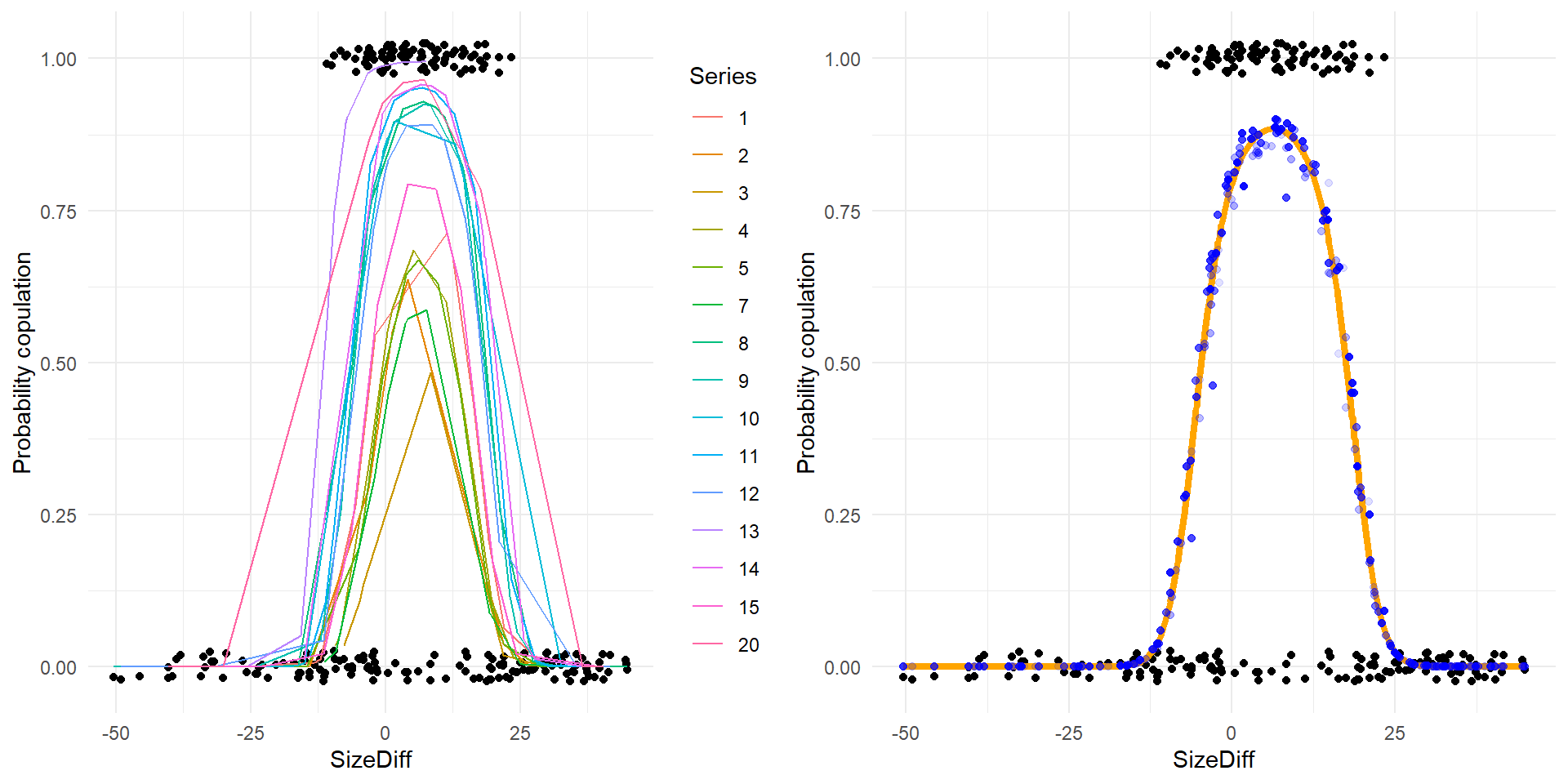
The plot on the left above shows predictions for various series of experimental trials, and the raw data. The plot on the right shows the overall fit (orange line – the grand mean with no random effects influencing the prediction), the predictions accounting just for random effects at the level of individual females (blue dots), and the raw data.
## could plot them all together -- code below gives some insight ## into the
## ggplot2 fortify method
if (require(ggplot2)) {
  g +  geom_point(aes(SizeDiff, plogis(.fitted)), color='darkgray', size=3,
                  data=fortify(gm0, d2))

## nb -- same as predict with all RE!
  with(fortify(gm0, d2),
       unique(pred_overall - plogis(.fitted)))
}
Checking model adequacy
With `lme4, you can also easily produce something akin to posterior-predictive
checks, a Bayesian
tool
for model criticism.
Using simulate on an lme4 produces a set of response data implied by the
model. By examining summary statistics of this dataset, and comparing them to
the actual data, you can examine how well, or poorly, the model fits. Note that
these checks are less rigorous than something like cross-validation. See
?simulate.merMod for additional information.
The upshot: these are relatively quick, and can provide a warning that your model isn’t capturing some aspect of the data. But, be aware there is controversy about their use for anything other than seeing how the model is capturing the data. Often, we’re interested in making more formal, frequentist inference. Though these checks are valuable, the p-like-values implied by them do not satisfy assumptions necessary for this kind of inference (i.e., don’t use them for model comparison or parameter inference).
## without RE
set.seed(1141)
gm0.sim_wo <- simulate(gm0, nsim=1000, re.form=NA)
sims <- sapply(gm0.sim_wo, function(x)  x)
ones <- colSums(sims)
zeros <- -colSums(sims-1)
perc <- ones/nrow(d2)
cvar <- apply(sims, 2, var)

## with RE
gm0.sim <- simulate(gm0, 1000 )
sims <- sapply(gm0.sim, function(x)  x)
re_ones <- colSums(sims)
re_zeros <- -colSums(sims-1)
re_perc <- re_ones/nrow(d2)
re_cvar <- apply(sims, 2, var)

pp_comp <- function(dist, cmp_fn, data, ...) {
  hist(dist, col='orange', xlab='value', ...)
  abline(v=cmp_fn(data), lwd=4, col='blue', lty=2)
  abline(v=mean(dist), lwd=4)
}

op <- par(mfrow=c(2,4))
  pp_comp(ones, function(x) sum(x$cop),
          d2, main='ones - no RE', xlim=c(45, 110))
  pp_comp(zeros, function(x) -sum(x$cop - 1),
          d2, main='zeros -no RE', xlim=c(120, 185))
  pp_comp(perc, function(x) sum(x$cop)/nrow(d2),
          d2, main='% cop - no RE', xlim=c(0, .8))
  pp_comp(cvar, function(x) var(x$cop),
          d2, main='var - no RE')

pp_comp(re_ones, function(x) sum(x$cop),
          d2, main='ones - all RE', xlim=c(45, 110))
  pp_comp(re_zeros, function(x) -sum(x$cop - 1),
          d2, main='zeros - all RE', xlim=c(120, 185))
  pp_comp(re_perc, function(x) sum(x$cop)/nrow(d2),
          d2, main='% cop - RE', xlim=c(0, .8))
  pp_comp(re_cvar, function(x) var(x$cop),
          d2, main='var - all RE')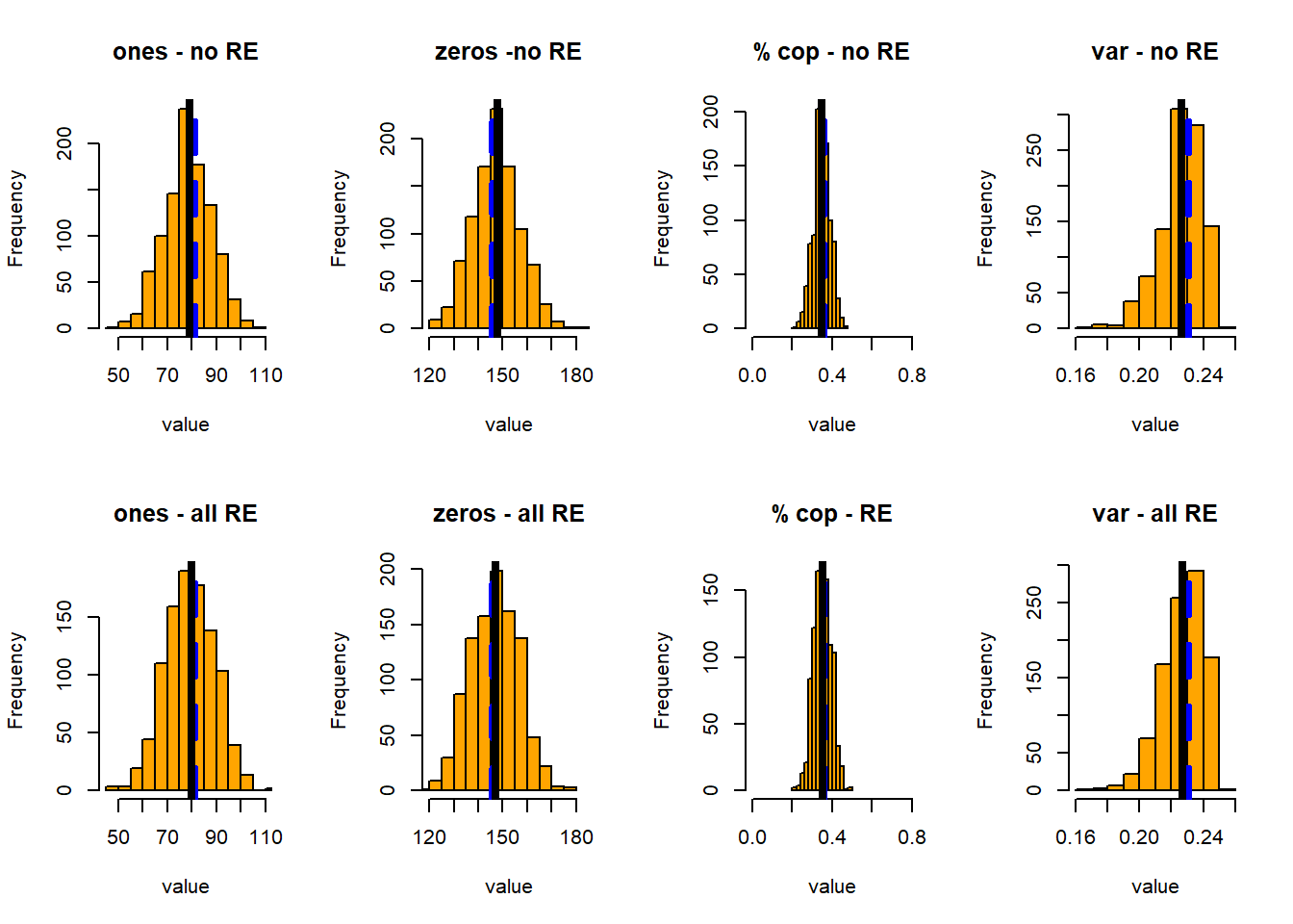
par(op)In this case I’ve plotted the simulated distributions of the number of ones, zeros, the proportion of copulations, and the variance in observed copulations – all with and without accounting for all the random effects. For each of these, I show the distribution of the statistic, its mean (black line), and the mean of the same statistic in the observed data.
All test quantities have broader distributions when we account for the random effects.
glmmADMB version (not run)
You can run many of the same graphical procedures (including the quick plots
from lsmeans!) on output from other frequentist fitting packages. Try it!
## look at glmmadmb too -- not evaluated
gm1admb <- glmmadmb(cop ~ geodist_scl +  sizediff_scl2, random= ~1 | Series + 1 | Female , data=d2, family='binomial')

d2 <- data.frame(d2, predict(gm1admb, interval='confidence', type='link'))

plot(cop ~ SizeDiff, d2, ylim = c(0, 1))
lines(plogis(fit) ~ SizeDiff, d2, lwd=2)
lines(plogis(lwr) ~ SizeDiff, d2, lty=2, lwd=2)
lines(plogis(upr) ~ SizeDiff, d2, lty=2, lwd=2)
      geom_line(aes(SizeDiff, plogis(lwr)), color='orange', size=1, linetype=2) +
    geom_line(aes(SizeDiff, plogis(upr)), color='orange', size=1, linetype=2) +
I haven’t read this simulation study carefully yet but a quick look implies the main problems occurred when fitting a model that gets the hierarchy wrong (e.g., a GLM to data generated from a hierarchical process under-performs relative to a transform + LMM)↩︎
Stroup also authored the CRC Press book Generalized Linear Mixed Models↩︎
Discussions with and classes from colleagues, including Scott Burgess, Andrew Latimer, Richard McElreath, and Will Wetzel, have also greatly improved my understanding of plotting and fitting mixed models.↩︎